ZFitness
A community fitness design, built natively in Kotlin and Swift.
- Role
- Mobile Engineer
- Context
- Personal learning project. Design by enes.onion
- Timeline
- October 2026 to present
- Platforms
- Android, iOS
- Status
Overview
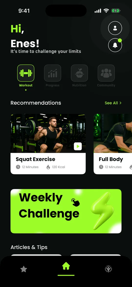
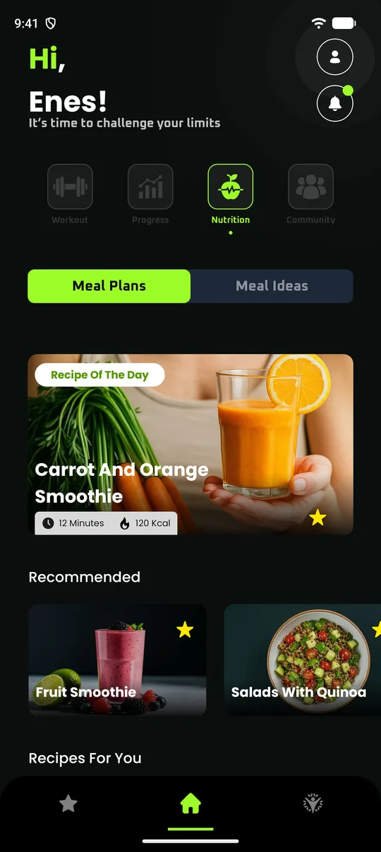
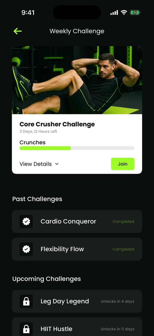
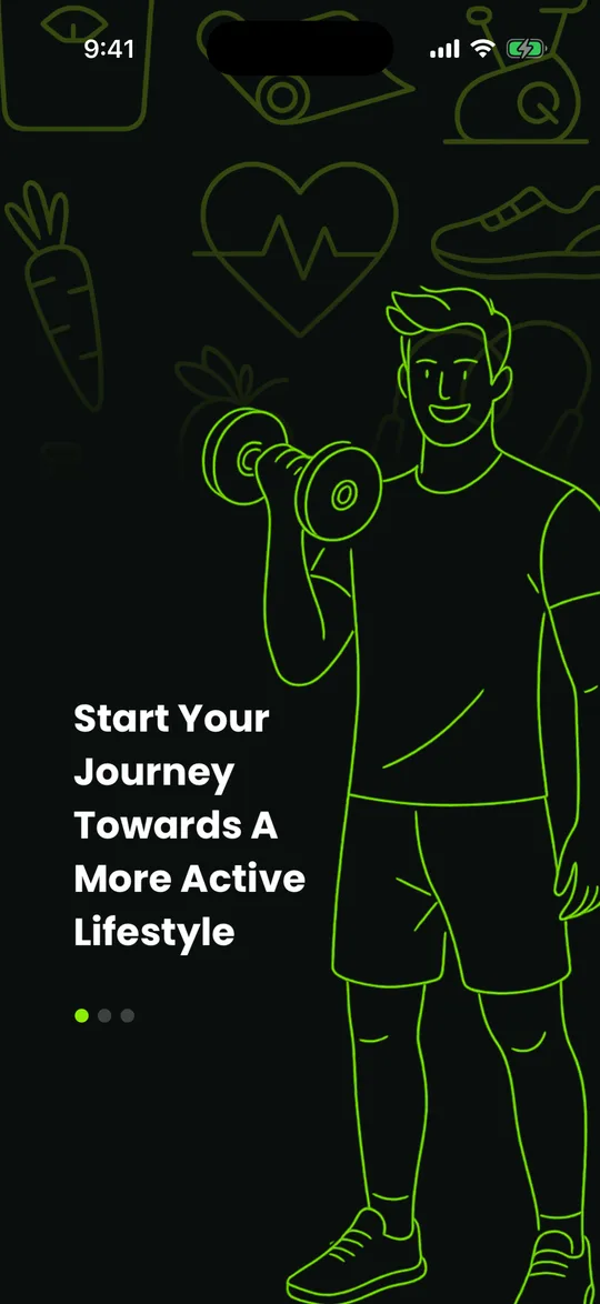
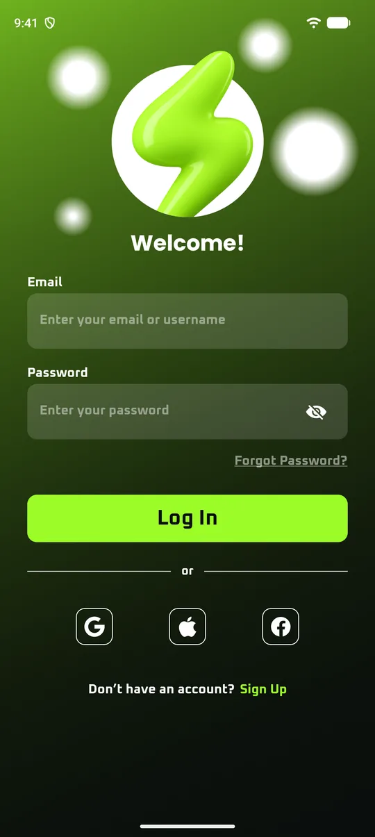
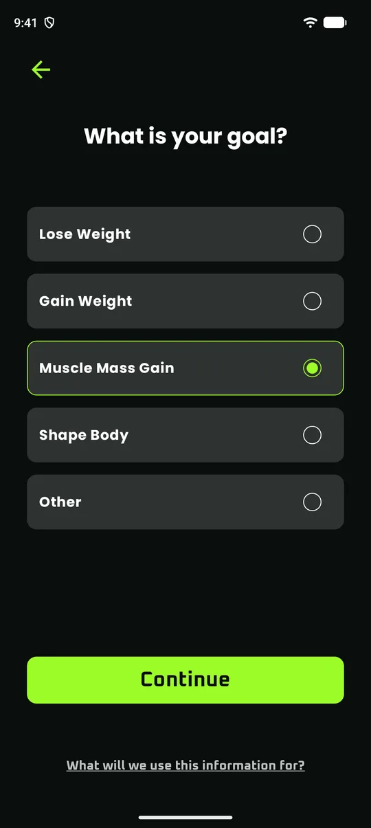
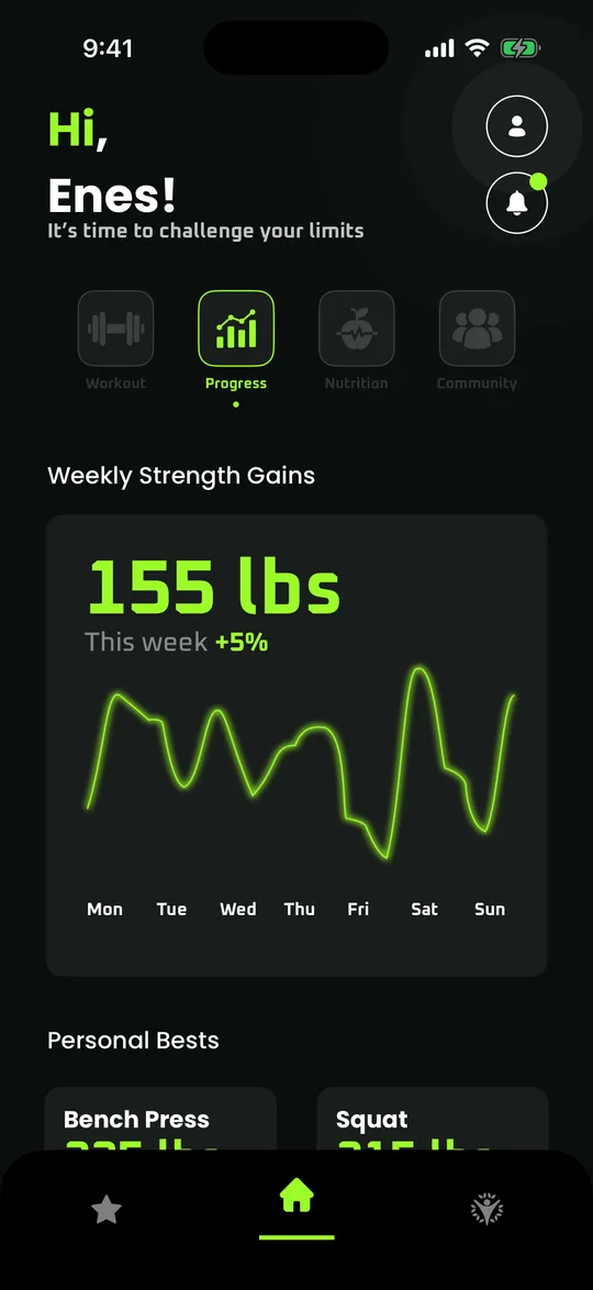
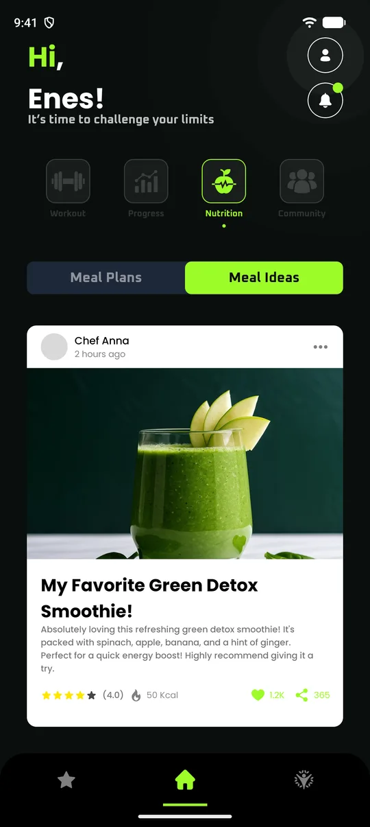
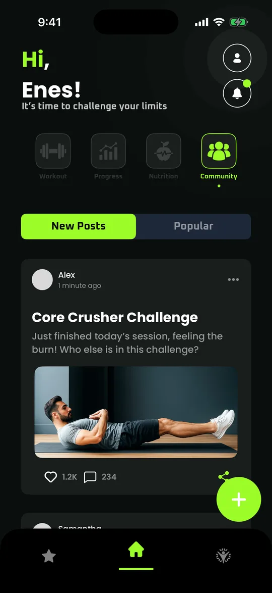
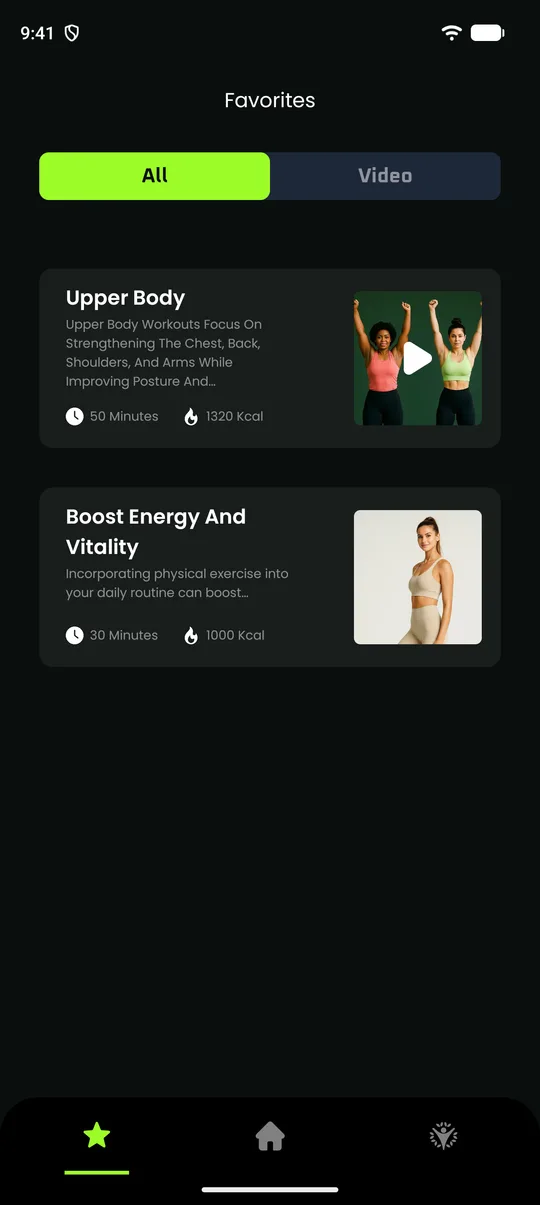
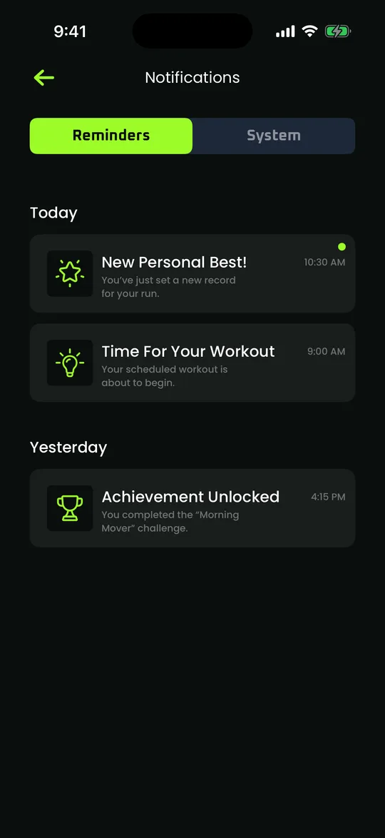
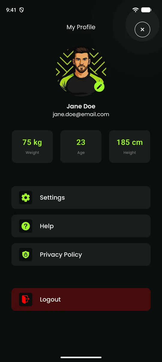
ZFitness is a fitness app with onboarding, sign-in, a seven screen profile setup, and a home screen for workouts, progress, nutrition and community. It also has favorites, notifications, a profile and a weekly challenge.
The design is not mine. It is a free community Figma file by enes.onion, including its illustrations and photos. My work is the engineering: turning those frames into two native apps that behave like real software, from the same design, on Android and iOS.
I started it to learn Kotlin and Jetpack Compose in public, then built the same 23 screens again in SwiftUI. There is no backend yet, so accounts and content are sample data and your answers stay in memory.
See it work
My role
I built the Android app while learning Kotlin and Compose, then the iOS version in SwiftUI, and wrote up the Android side as I went. I did not design the screens: enes.onion did, and I worked from their Figma values.
The challenge
Figma describes a fixed 393 by 852 frame. Real phones have notches, home indicators and different widths, and the design needs to keep working on them, on two UI toolkits that handle layout, gradients and scrolling differently.
- Match the design closely, using its own photos, icons, fonts and measurements.
- Native on both platforms, with no shared UI layer.
- Android support back to Android 7 and iOS support back to iOS 17.
- No backend yet, so nothing can depend on real accounts or content.
Architecture
Figma file
Third party
Screens
Built by me
Navigation
Built by me
Sample data
Built by me
More screens
Engineering challenges
One measurement, two units
- problem
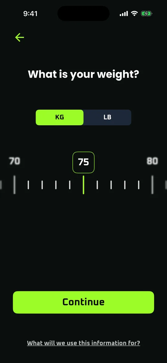
- The weight and height screens let you switch between KG and LB, or CM and inches, on a draggable ruler.
- constraint
- If the rest of the app had to know which unit was on screen, every later feature would inherit that problem.
- approach
- The ruler shows whichever unit you chose, but each screen reports a metric value upward. Switching unit converts the current value and builds a new ruler at that position, so 75 kg becomes 165 lb.
- result
- The rest of the app only ever deals with kilograms and centimetres, and the same code handles both questions.
A bug only the real flow could show
- problem
- On iOS the age picker should open on 22, and it did every time I opened that screen directly.
- constraint
- Reached through the actual flow, the screen slides in, and a scroll view being pushed ignores scrolling until its first layout is done.
- approach
- An automated UI test that taps through the whole app caught it opening on 20. The picker now builds its numbers up front, waits for layout, scrolls to the value, and only then starts reporting changes, so the wrong position can never overwrite the answer.
- result
- The test checks the picker opens centred on 22 and that the picked age reaches the profile screen.
Gradients that match Figma
- problem
- The green glow on the login and welcome screens looked too bright when drawn with the default gradient.
- constraint
- Figma fades a colour to transparent without premultiplying alpha, which Compose’s gradients do not do, and Compose’s blur modifier needs Android 12.
- approach
- Both apps sample Figma’s fade curve into several gradient stops. On Android, soft blurred shapes are drawn as gradients instead, so they look the same on older phones.
- result
- The same gradient values from Figma’s CSS produce the same look in Compose and SwiftUI.
Photos cropped the way the design crops them
- problem
- The design shows a specific part of each photo, and a plain crop only ever centres the image.
- constraint
- Several cards also stretch with the screen, so fixed offsets would leave a gap past the photo’s edge on wider phones.
- approach
- A small placed photo component in each app draws the image at Figma’s size and offset, and scales the whole placement when a card is wider than in the design.
- result
- Every photo shows the same framing as the Figma file, on each phone size I checked.
Outcome
23
screens built on both Android and iOS
Kotlin + Swift
two native apps, one design
Start to logout
walked through by an automated UI test on iOS
I started testing on smaller screens and doing proper design reviews, instead of assuming a screen is done when it looks right on my emulator.
Technologies
Links
ZFitness is a learning project with sample data and is not on the App Store or Google Play. The design belongs to enes.onion. These posts show the Android work as it progressed.